

2013 was an interesting year for Apple.
Jony Ive’s move to the head of software design bore its first fruit with the launch of iOS 7, shaking up some established Apple design conventions and breaking a long-held pattern of focused iteration in a company not known for its wild mood swings. So what do Apple design developments from 2013 tell us about what to expect for iOS and the Mac this year?iPhone first
From the first iPhone OS, Apple’s mobile design style has been to make things look like things: Clear lines, friendly gradients, and shadows you could lose your keys in. This overt physicality had its roots in Mac app design, but really found its home on the iPhone and iPad—devices on which pressing a button meant literally pressing your finger onto something. Designers learned to make everything feel real. As iOS became more successful, many of those embellishments of literalism found their way back to the Mac.
Then, with a single organizational restructuring, everything changed. Jony Ive took over software design, and iOS 7 is his big splash. Software begins to feel less like a coat of paint and more like a logical extension of the hardware. When Apple unveiled iOS 7 at WWDC in June 2013, you could almost hear the pendulum swinging. Hyper-literal interfaces and textures—with the bizarre exception of paper in Notes—are history.
One example of the swing towards UI as an extension of the hardware: Early in the iOS 7 beta process we saw Apple focus on, then dial back on, the lightness of typography. Helvetica Neue Light may have taken center stage at WWDC, but by the third beta release, Apple had heard the cries of users. The attempt made sense. Ive, a hardware guy, would naturally want to show off the readability of text in lighter weights on a Retina screen. But users are less interested in smaller or wispier fonts than in clarity; just because you have a Retina doesn’t mean you should cram more user interface onto it.
As it stands now, iOS 7 is a series of solvable problems. The things you could label as deficiencies are mostly a result of that swinging pendulum—an overcorrection of skeuomorphism. So what comes next is most likely balance and refinement. Buttons might not need to look like they’re being physically pressed in you tap them, butsome feedback is useful. Text-label buttons (such as Send in Messages) don’t need to be visually heavy, but it’s generally better to give users a sense of tap target size.
Ive has now had more than a year of mobile UI design experience under his belt, and nearly nine months of critical user feedback on a major release. These aren’t small things, especially for a man known for his thoughtful, considered approach. Despite formidable resources, Apple is still a small company in many ways. Historically, when iOS has been behind on deadline, developers have been pulled from the Mac OS X team to lend a hand. Designers are commonly shared between teams. Given his position at the top of the design food chain, that certainly includes Ive.
iOS 7 was a rare large leap forward all at once. To me, the most exciting thing about iOS 7 has always been iOS 8. I think we should expect iOS 8’s changes to come in Apple’s traditional flavor: slow, steady, and incremental.
Back to the Mac
So how would this hardware-meets-software approach to human interface design work on the Mac? OS X is a very different platform from iOS, visually. Not just in terms of screen real estate, but the way applications coexist. On iOS, only one app is open and in use at a time, whereas the Mac not only allows for but encourages multiple apps sharing the same visual space. An argument could be made that designing for the desktop is a trickier proposition than for mobile, where the device becomes the app. Perhaps full-screen mode is still waiting for its moment, but as it stands today the Mac is still visually a multitasking environment.
Another sticking point with the desktop is file hierarchy. On iOS, individual apps more or less own their documents, while OS X has a long history of files being organized into folders, with a separate file-manager app. And where iOS was prone to literal visual representations of concepts, the desktop has always been a collection of conceptual metaphors: files, folders, windows, and the desktop itself. That legacy can’t be swept away cleanly in one step, and that’s okay. The purpose of having iPhones and iPads and Macs isn’t to provide the same experience in different shapes, but to contour the experience to the device. In that respect, Mac OS has a very long lead on iOS.
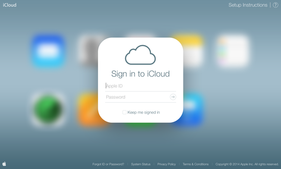
So how do you apply the lessons learned in iOS 7 to the Mac? For one possibility, look at the interesting facelift iCloud.com’s Web apps have undergone. The animations, curves, and layout feel like a desktop-friendly reimagining of iOS 7. It’s not hard to imagine this as a testbed or preview of how iOS 7’s design ethos could apply to the Mac—and it’s a good-looking translation.
However, iCloud.com needs to serve a single group of apps, one at a time. How would this look translate to multiple windows on the same screen? Borderless text buttons—which already feel like hyperlinks and therefore right at home on a Web app—may not translate as well to a desktop OS. But the spirit is there, and it’s not hard to imagine a clean, minimalist interface that could provide the right amount of visual separation to make it work.
The Mac has had years to iterate through changes in Apple’s traditional style. Yet the biggest changes in iOS 7 were also primarily visual. Nobody can deny that iOS 7 looks dramatically different than the versions that came before it. But underneath the sparse new visuals, things still more or less work the same way. Retina screens aren’t yet ubiquitous on the Mac (and may not be for some time), but as display technology marches forward, typography will play a larger and larger role. Given OS X’s history and the lessons learned from the iOS 7 reveal, perhaps the changes will be addressed with more subtlety.
Apple senior vice president of software engineering Craig Federighi recently told Macworld’s Jason Snell, “You don’t want to say the Mac became less good at being a Mac because someone tried to turn it into iOS. At the same time, you don’t want to feel like iOS was designed by [one] company and Mac was designed by [a different] company, and they’re different for reasons of lack of common vision.”
2013 was the year Apple’s hardware and software began to blur together. We’ve seen the first grand steps of a company with a common vision for design. What makes the last year so interesting isn’t the degree to which things changed, but how quickly those changes took place. Apple’s usual track of pushing ever forward with gradual changes—reinventing products slowly, with precision and consideration—gave way to a single leap that may not be fully understood or realized for some time. The Mac will keep on being the Mac and the iPhone will keep on being the iPhone. But I bet they’ll look great together.
